At-a-Glance 👀
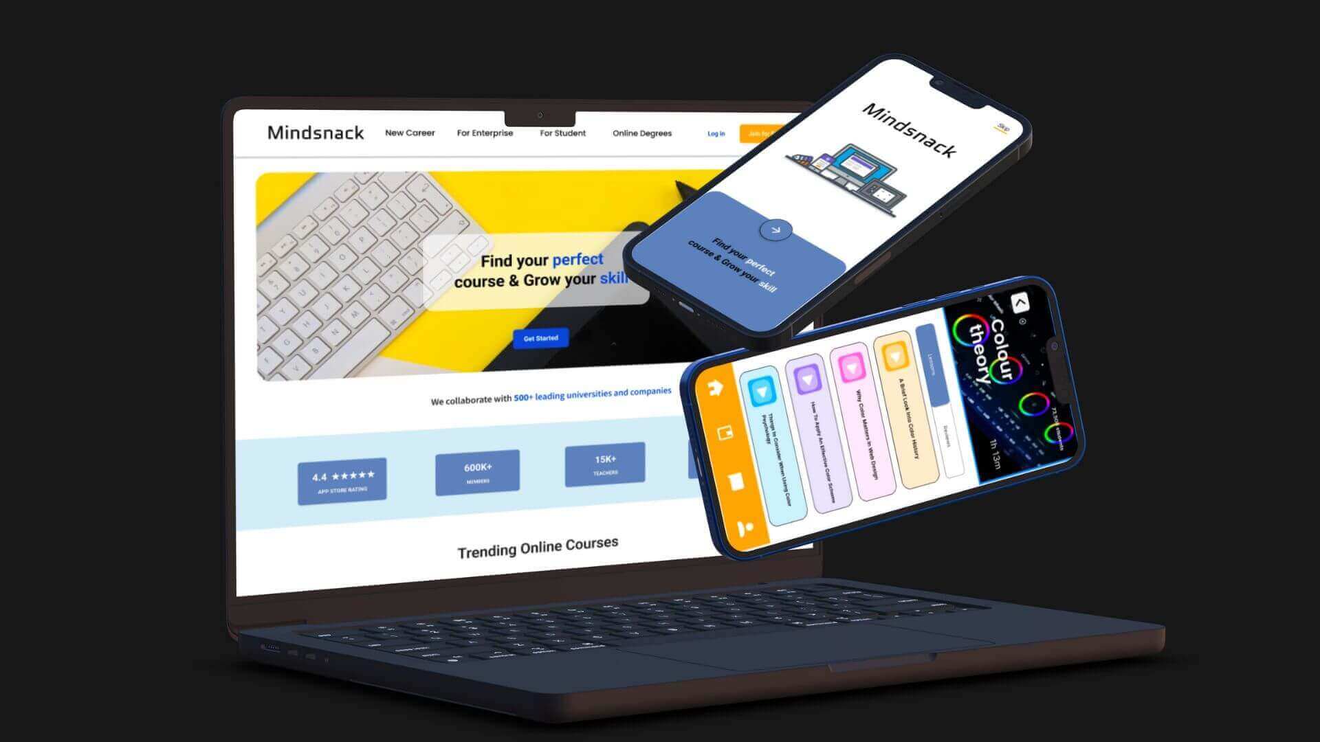
I worked on a personal project for 3.5 months in 2022. I worked to design an IOS mobile app and one-page landing page for MindSnack to increase user engagement, retention and motivation through gamification.
In 3.5 months, I completed three rounds of design iteration, including sketching, wireframing, and prototyping based on user testing and feedbacks. I also worked on the design system, branding and design hand-off to bring the product from 0 to 1.
Problem
MindSnack is a popular e-learning platform that offers a wide range of courses to learners of all ages. The platform has been operational for several years and has a substantial user base.
👉 However, recent data analysis has revealed a concerning result of declining user engagement, motivation, and retention rates. These issues threaten the platform's long-term sustainability and growth of MindSnack's online business.
Solution
To address these issues and improve user engagement, motivation, and retention, the following strategic plan is proposed:
🚀 Ongoing Learner Support
🚀 Peer Interaction and Support
🚀 Gamification and Reward systems
Design Process
After understanding the company's needs and expectations, I designed 👉 a low-fidelity prototype. I ran 👉 user testing with 10 participants and incorporated the feedback to refine the design, resulting 88% user satisfaction rate. Subsequently, I created 👉 a high-fidelity prototype.
User Research
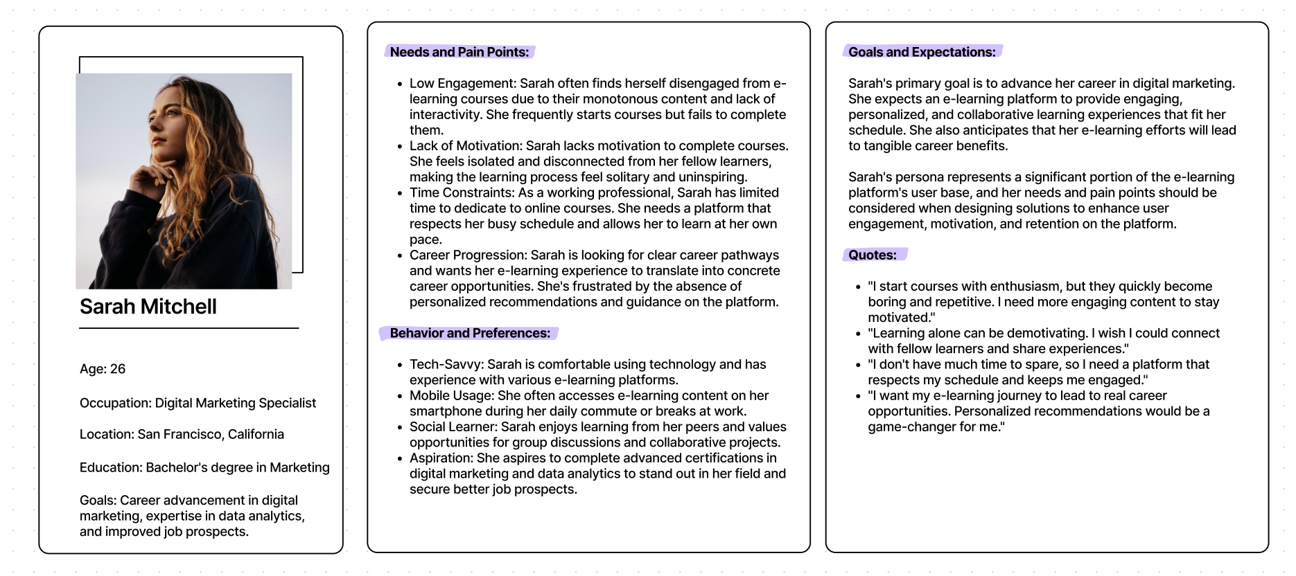
I conducted supervised user research and received feedback from users that we incorporated into user persona. For example, our persona Sarah struggles to stay engaged due to monotonous content and frequently starts but fails to complete courses. She feels isolated and disconnected from fellow learners, seeking a more inspiring and interactive learning experience.

User Journey
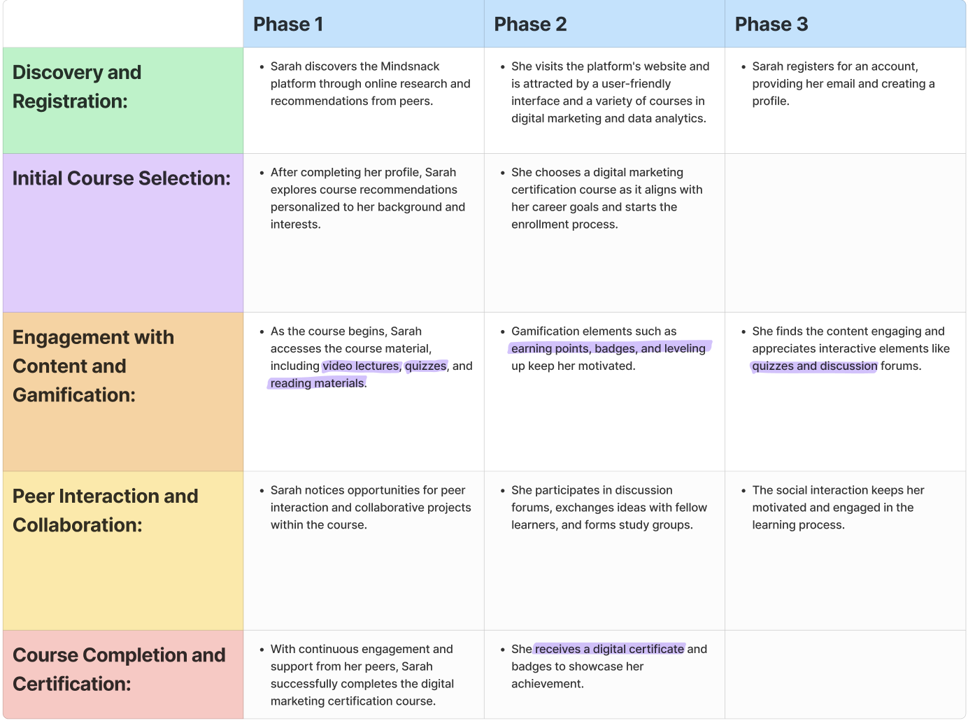
I also created a user journey to better illustrate the challenges of individuals who learn from home and online. This journey outlines the various obstacles learners encounter throughout their online education experience. By detailing the difficulties that students may face, we can identify areas that require improvement and work towards creating a better learning environment for everyone.

Sketches, Wireframes & Prototypes
The process below begins with my initial ideas wireframes, then moves to mockups, and finally to the high-fidelity prototype. In this simple version, you can see how the I approach solves the user needs.
I then brought my idea to an interactive digital low-fidelity prototype and brought it to five potential users to collect feedback.
Usability Study
As a team, we conducted a user testing session on twenty participants. I then took the responses through a card sorting exercise to find common themes amongst the participants.
Major Design Iterations 🔁
I made three major modifications based on the feedback that I received from the usability testing sessions. I took note of the user comments and suggestions, and worked hard to implement them in a way that would provide the best user experience possible. My goal was to create a product that was easy to understand, efficient to use, and enjoyable to interact with. To achieve this, I paid close attention to the user feedback and made changes accordingly.
