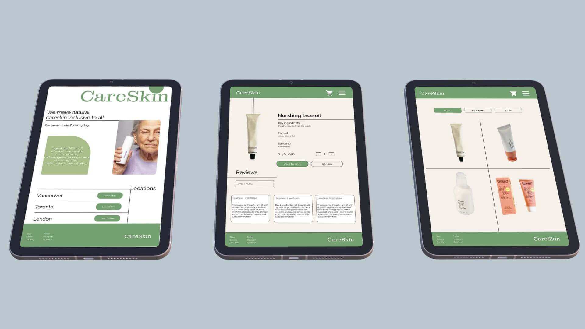
Project Context
I am passionate about UI/UX design, particularly the challenges of improving e-commerce interfaces. This case study delves into my journey to design the user interface for a fictional skincare company, Careskin. My primary goal was to simplify the online shopping experience and reduce cart abandonment while adhering to user-centric design principles and guidelines.
Project Objectives
1. Enhance the user experience for online shoppers.
2. Reduce cart abandonment rates.
3. Implement human interface guidelines and Gestalt principles.
4. Incorporate insights from user research to meet user expectations.
User Research
To ensure a user-centric experience tailored to the target audience's needs, I began by creating a robust user persona. This persona helped me gain a deep understanding of the characteristics and preferences of the target audience. By empathizing with the users, I was able to design an experience that truly catered to their needs.
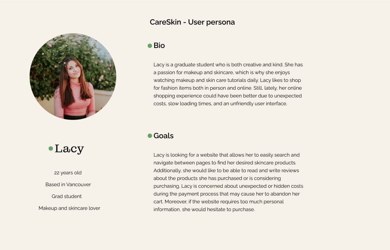
Initial Research
I identified common pain points:
1. Unexpected Costs: Users were deterred by hidden costs.
2. Mandatory Account Creation: Creating accounts felt like an unnecessary hurdle.
3. Limited Payment Options: Users desired more payment flexibility.
4. Excessive Personal Information: Lengthy forms discouraged users.
5. Website Security Concerns: Users needed reassurance.
6. Window Shopping: Users abandoned carts without making a purchase.
Solutions
To tackle these issues, I implemented the following solutions:
1. Transparency: All costs, including taxes and shipping, were displayed upfront.
2. Guest Checkout: Users could proceed without mandatory account creation.
3. Payment Flexibility: Multiple payment options were integrated.
4. Trust Building: Reviews and testimonials were included for credibility.
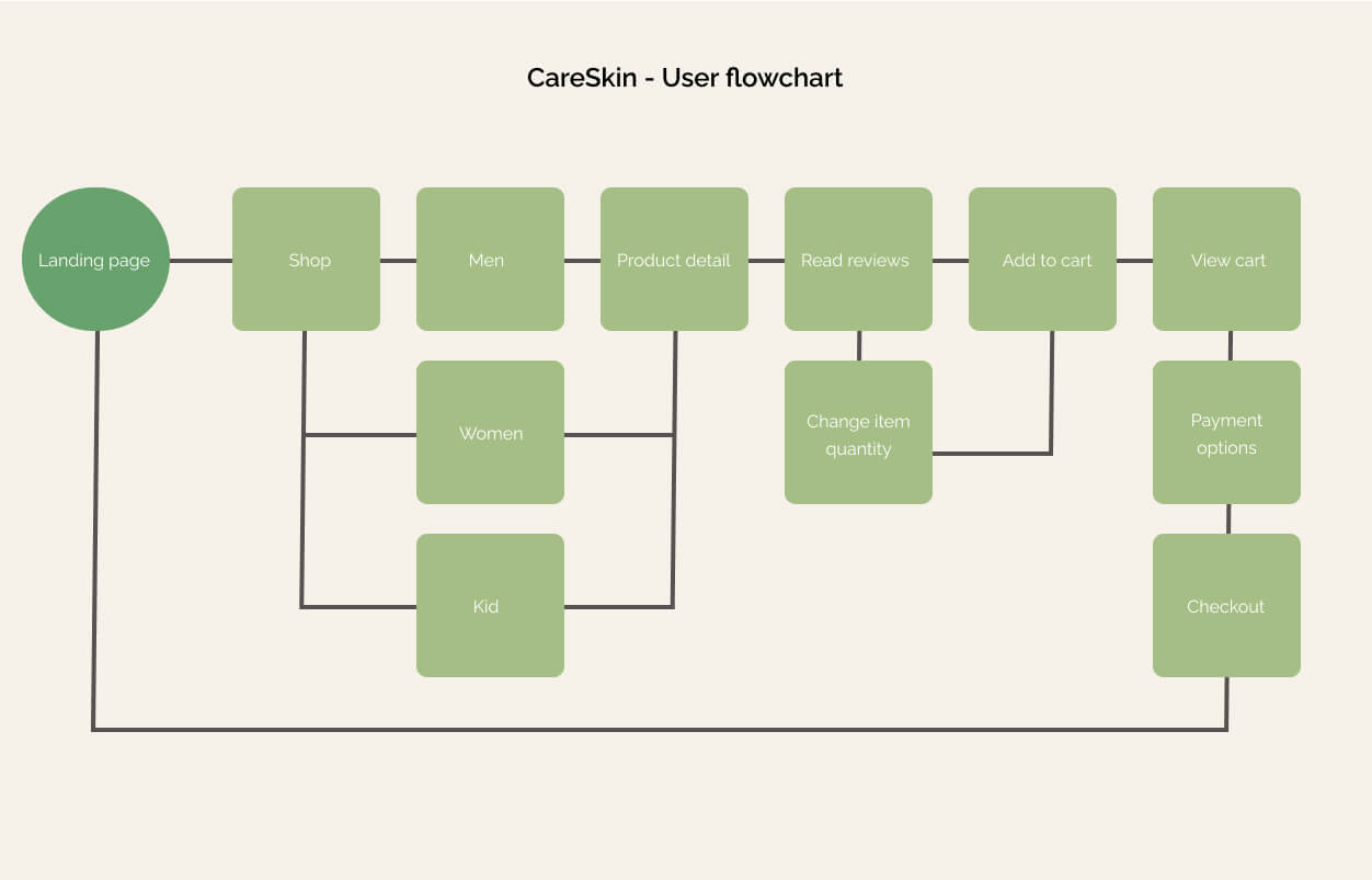
User Flowchart
I have designed a visual map, also known as a user flowchart to illustrates the possible steps users take to achieve their goals and navigate through a product. The chart clearly explains every route a user could take from the entry point to the end of their interaction with the product. User flow diagrams serve as a guide to help me create an optimal user experience by showcasing all the essential steps and purposes of the product.
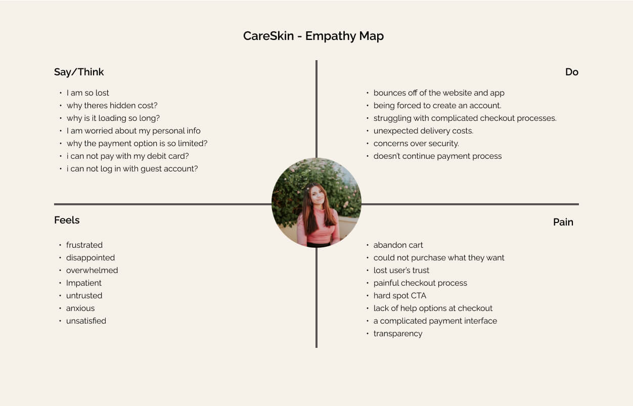
Empathy Map
During my user interview with participants (I asked several friends and classmates to shop online), I documented their emotions, thoughts, actions, and purchases while shopping online with competitor products. This enabled me to efficiently identify opportunities and prioritize user needs by creating an empathy map for this fictional project.
Design System
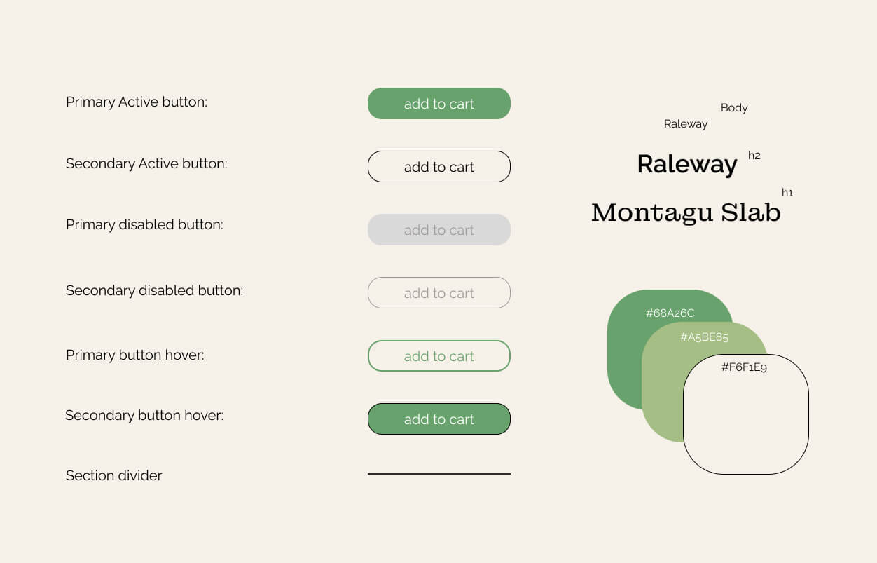
I designed the UI to be minimalist and elegant while adhering to design standards for visual elements such as buttons, hover effects, typography, spacing, and colour. I referred to human interface guidelines for button size, margin, and grid on Apple platforms such as the iPad, iPhone, and watch interfaces. I kept my design documents and Figma files clean and organized to ensure effective communication with developers, designers and engineers.
Usability Test Result
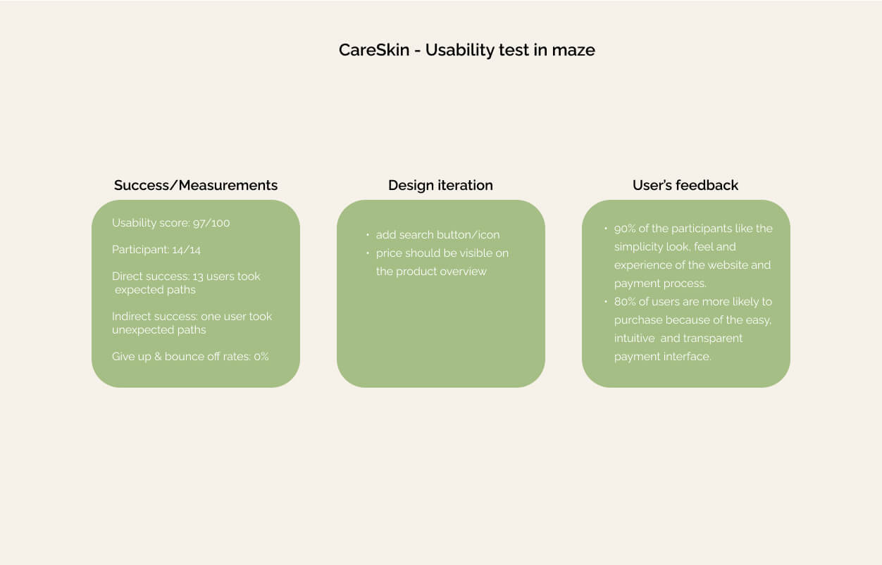
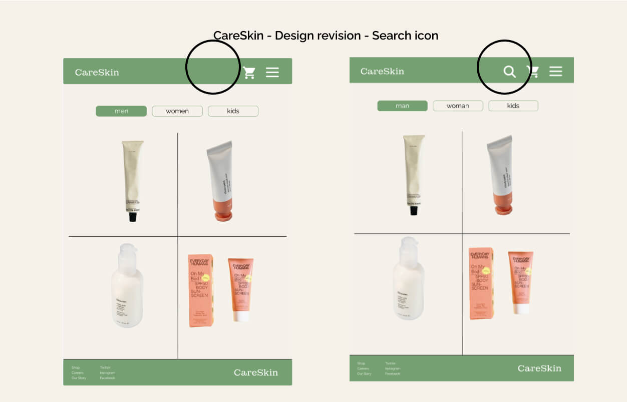
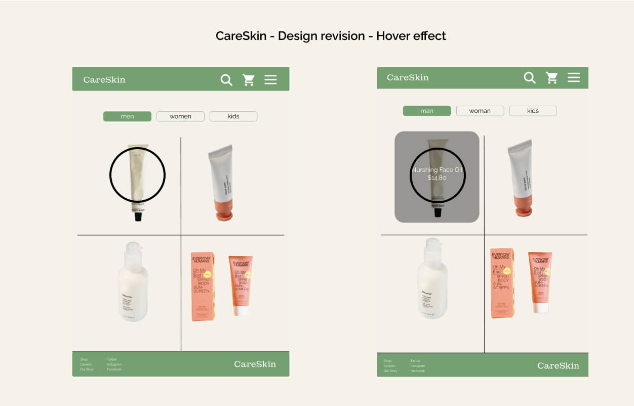
Utilizing Maze, I conducted usability tests, achieving an impressive score of 97 out of 100. Users remained engaged, and their feedback led to further improvements in the prototype.
Summary
This project was a rewarding journey of solving user pain points and creating an MVP design grounded in extensive research. I gained valuable insights into user behavior and decision-making in online shopping.
Key Contributions:
1. Filter button and guest account for streamlined checkout.
2. Transparent pricing and multiple payment options to enhance trust.
3. Enhanced user experience, resulting in reduced cart abandonment.
4. Creation of accessible components for design efficiency.
